| Table of Contents |
|---|
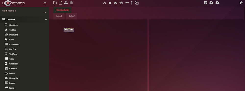
General View
Once the project is created, the main screen will be seen like this.
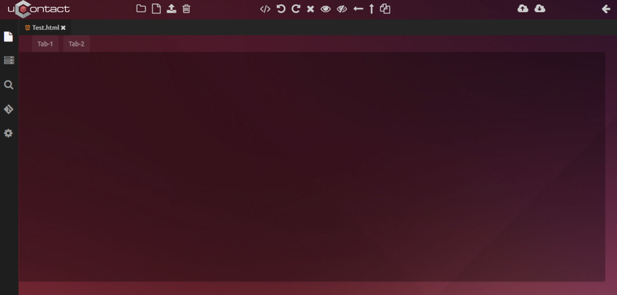
General Menu
On the left of screen can see the general menu that divides in five parts:
 Actual Project
Shows the files that the user opened, which ones can be closed by clicking the cross next to it.
Apart from that, all the files that have the opened project will appear listed.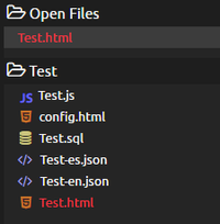
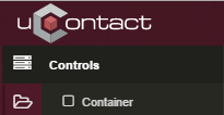
 Controlers
Contains all elements that are going to be used in the creation of the new project, for example Buttons, Labels, CheckBox,etc.
This ones are insterted using Drag&Drop, which facilitates the use of the Form Designer to the user. Simply drag one element to the container to the drawing section, and when droped, it will automatically be instaled.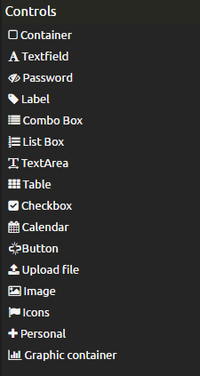
 Search
On the top part of this section, the user can make searches on every project file. When the user clicks on one, automatically is taken where the result is.
Search Example:
The word searched is highlighted in the js file for a better visualisation. Projects
The user has a history with all the changes made in the form, when the user clicks on one of them, the change made will appear as a before and after. Next to every change listed there will be an arrow that undones the change.
 Configuration
Controls the letter size and screen style when visualising the files code.
Files
On the top left of the screen we can see the following buttons:
...
- New Project
- New File
- Upload File
- Delete
Synchronise
On the top right sector of the screen we can see the following buttons:
...
- Deploy: Saves the file changes.
- Download: Downloads the last saved change made on the project.
Tools
When opening the main .html file of our project, on the top margin of the screen will appear the following buttons:
...
- Change View: From design to code or vice versa.
- Undo Changes
- Redo Changes
- Delete Element: Deletes the selected element.
- Show Hidden
- Hide Hidden
- Align Left: This will align the selected element to the one that is far on the left.
- Align Top: Same as left but will align to the far element on the top.
- Copy elements
Controls
Controls Menu
This menu contains a list with all the controllers or elements that will be used on the creations of the form.
To be able to use on the forms you must click on the desired controller and drag it to the container where we want to put it.
...
The user can select more than one control by clicking on them and move them around as a group. To deselect this ones, just click again.
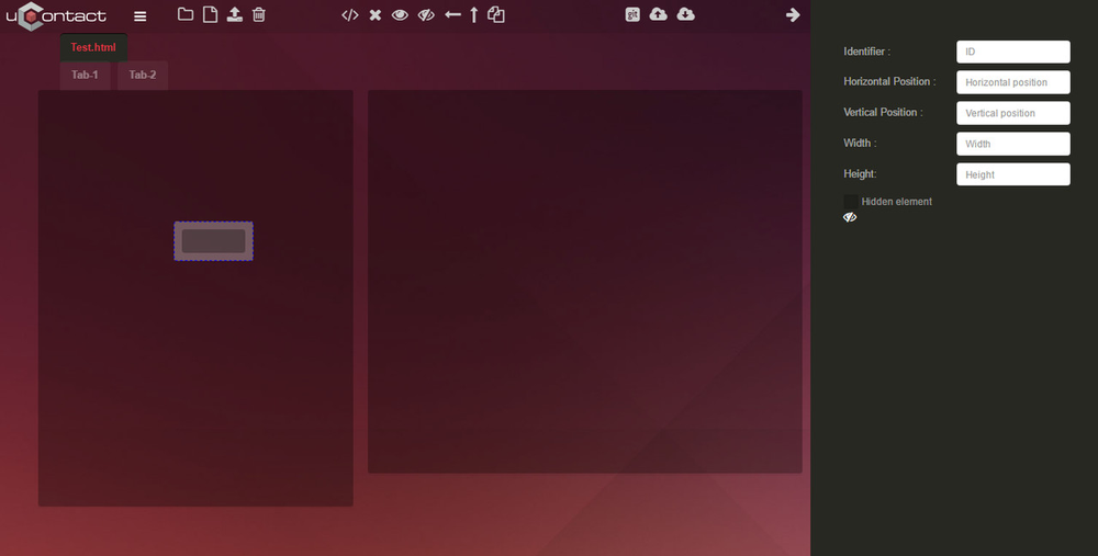
Properties Menu
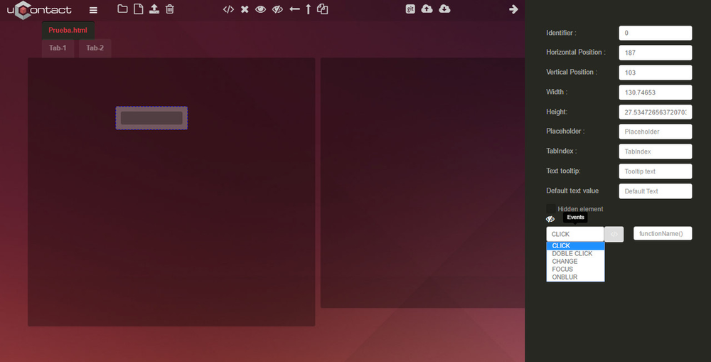
You can open the properties menu by double clicking an element or by having one selected and clicking the arrow on the top right corner of the screen.
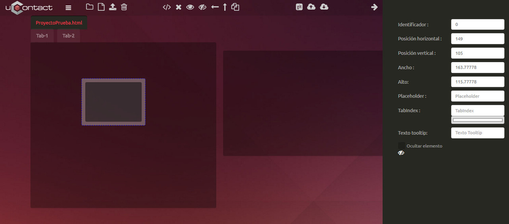
On this menu we can modify the properties or attributes of the selected element like its identifier, vertical or horizontal position, height and width and many more.
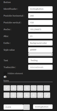
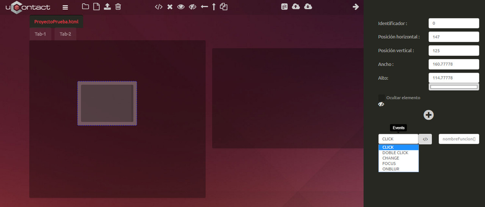
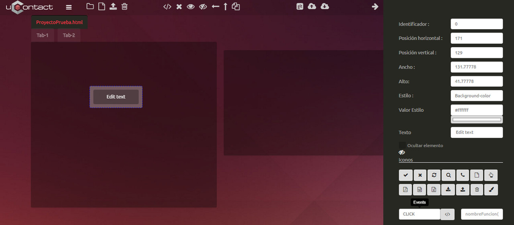
Note: The controlers that have the option of adding an event, for it to redirect the user to the code using the button  , the box next to it must be filled with an existing function located in the file PROJECTNAME.js
Uses of the Controls
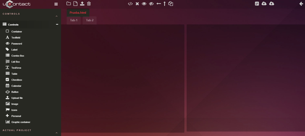
Container
The container control are a few boxes or rectangular spaces. On it we can insert HTML content. Its main utility is visual, by allowing to organise and to give a structure and design to the form.
By default the html already has a container. If we want to use more than one container we need to delete or reduce the existing container because one container can not be on another.
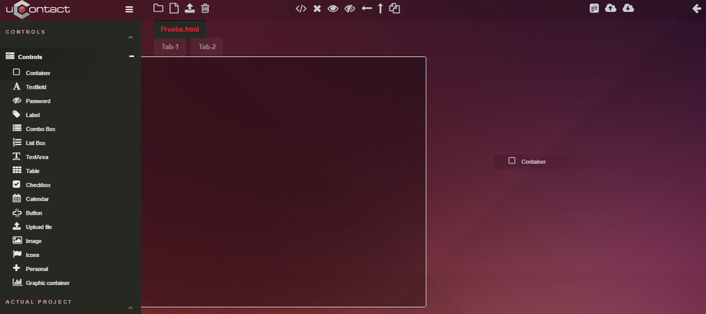
The result of dropping the container.
Text field

Whether his driver is a text box,
...
Other functionality in the properties is to add an event to the element. On the next image we can see the events that can be added to the element by always putting a reference name.
Password

The difference on the textfield is that this will use a password and so we want that, when the user is typing, he can see asterisks (*) instead of the real password.
Label

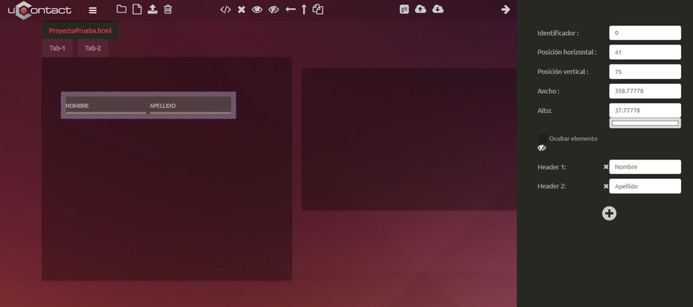
ComboBox

On its properties it can be assigned an identifier, change positions and size. Besides we can hide the element using a checkbox.
Other functionality in the properties is to add an event to the element. On the next image we can see the events that can be added to the element by always putting a reference name.
ListBox

On its properties it can be assigned an identifier, change positions and size. Besides we can hide the element using a checkbox.
Other functionality in the properties is to add an event to the element. On the next image we can see the events that can be added to the element by always putting a reference name.
TextArea

Table

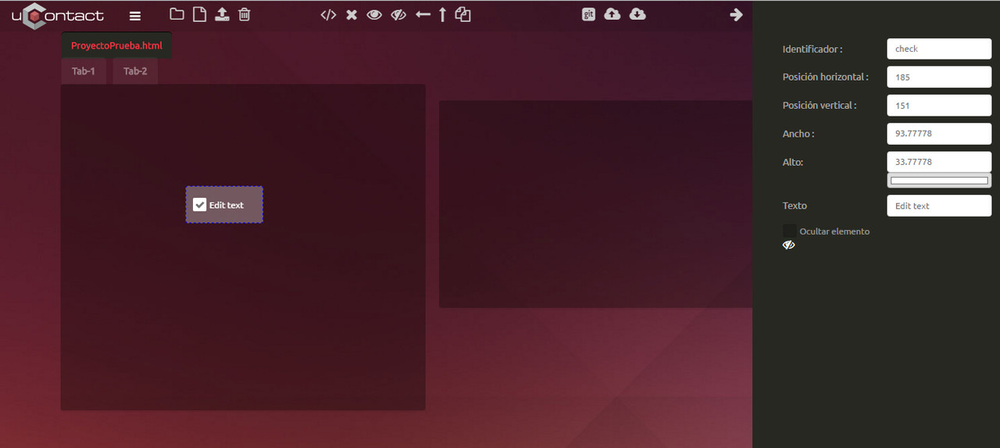
CheckBox

In its properties you can add an identifier, change positions and size, you can add a default text and you can set the element as hidden by clicking on the checkbox.
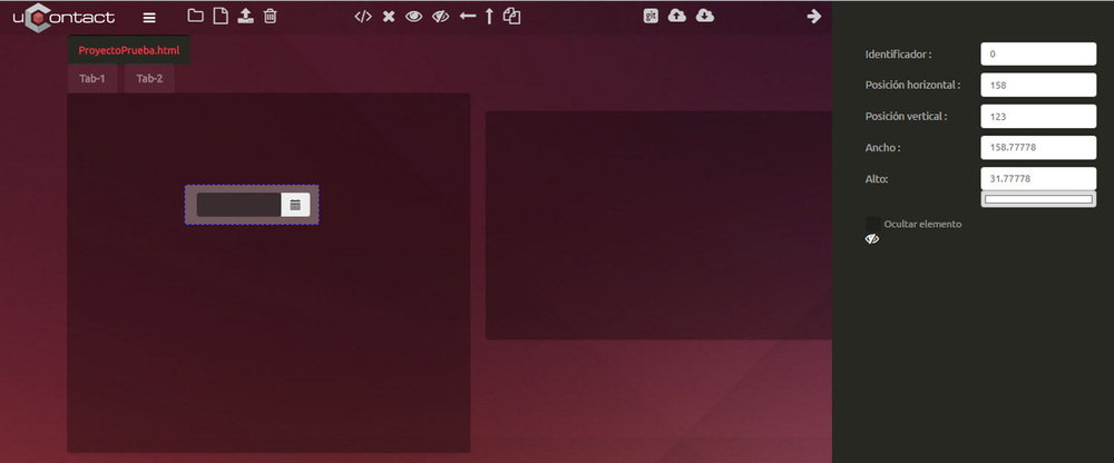
Calendar

Button

...
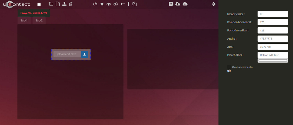
Upload file
Its functionality is to upload local files to the user when using the form.
On its properties you can add an identifier, change position and size, a placeholder to set a default word on the text box and to hide the element by using the checkbox.
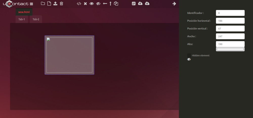
Image
This controller allows us to upload an image to the form.
Icons

This controller allows us to upload an icon.

Personal

Graphic container
This container adds a div on the html to be able to create charts.
Actual Project
Show the project that is actually working with all the fields of the own project.
Note: The files that are red marked, are those ones that have changes made on but are not deployed.
Files created by defect in the new project
SQL
One .SQL default file is created, the role of this file is to be able to relate all you need the form of a database, form creating tables, Insert,etcJS
A .JS file is where the logic will form in the corresponding JavaScript language.Config.html
Another file that created us is config.html, it is responsible to relare all the configuration of the form, from plugins needed, JS, stylesheets,etc.HTML
We also create an HTML, which will form the interface.JSON
And finally a appcache file , two files with this extension will appear, which ones are used to Internationalise the Form. Apart from the English and Spanish ones, more can be created for different lenguages
...